UX Writing at Mentimeter
Here are select pieces of work during my time at Mentimeter from April 2022 - July 2022.
Finding Mentimeter’s product voice
Encouraging conversion
Clarifying how to join and vote on a Menti
Content design system guidelines
Finding Mentimeter’s product voice
For a company who advocates for all voices to be heard, it was important that Mentimeter had a clear and consistent product voice. So one of the first few things I did when I started at Mentimeter was try to identify the tone of voice to help me write copy that was more on-brand.
We have an existing Mentimeter brand voice that I leveraged for this project:
Friendly
Fearless
A bit nerdy
Process
Mapping out user research feedback
I created a Mentimeter presentation to user test the tone of voice.
I recruited two colleagues in Mentimeter who understood the product well enough to participate in this user testing.
The test involved asking what they like and dislike about version A vs. version B. I also asked them to express how a specific block of text made them feel. After the test, I mapped out their feedback onto a Miro board.

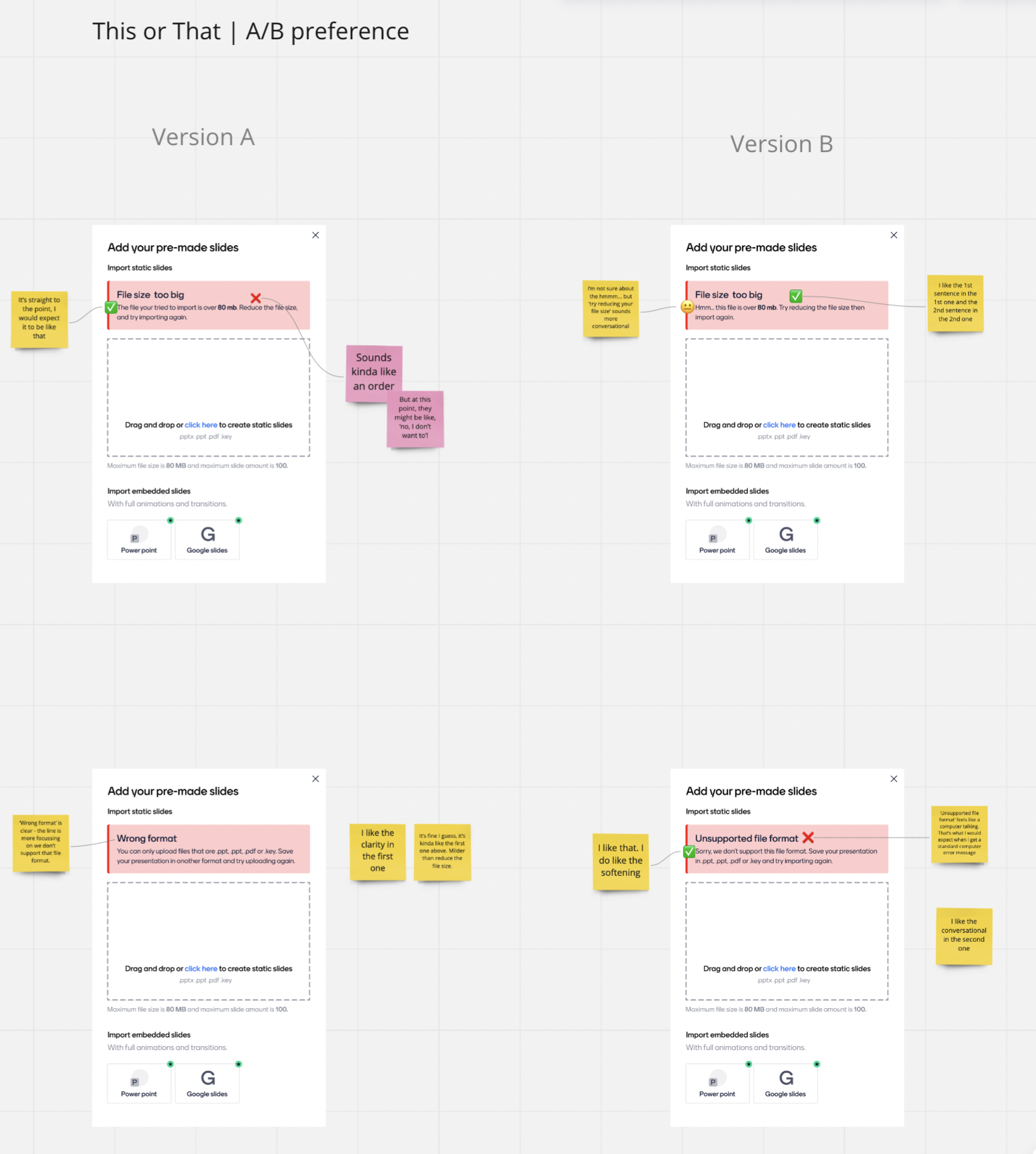
2. Analysing the results
After mapping the feedback, I then analysed the results by grouping the sentiments based on how we identify.
Be like this
We want to emotionally connect with our users and bring joy and delight to them, so we are:
Fun and have a good sense of humour
Warm, kind, and personable
Responsible!
Not like this
We’re not a corporate powerhouse, so a suit-and-tie language is just a little too uptight for us. Loosen up and tone down the formality so that we’re not:
Bossy
Cold
Verbose
Boring

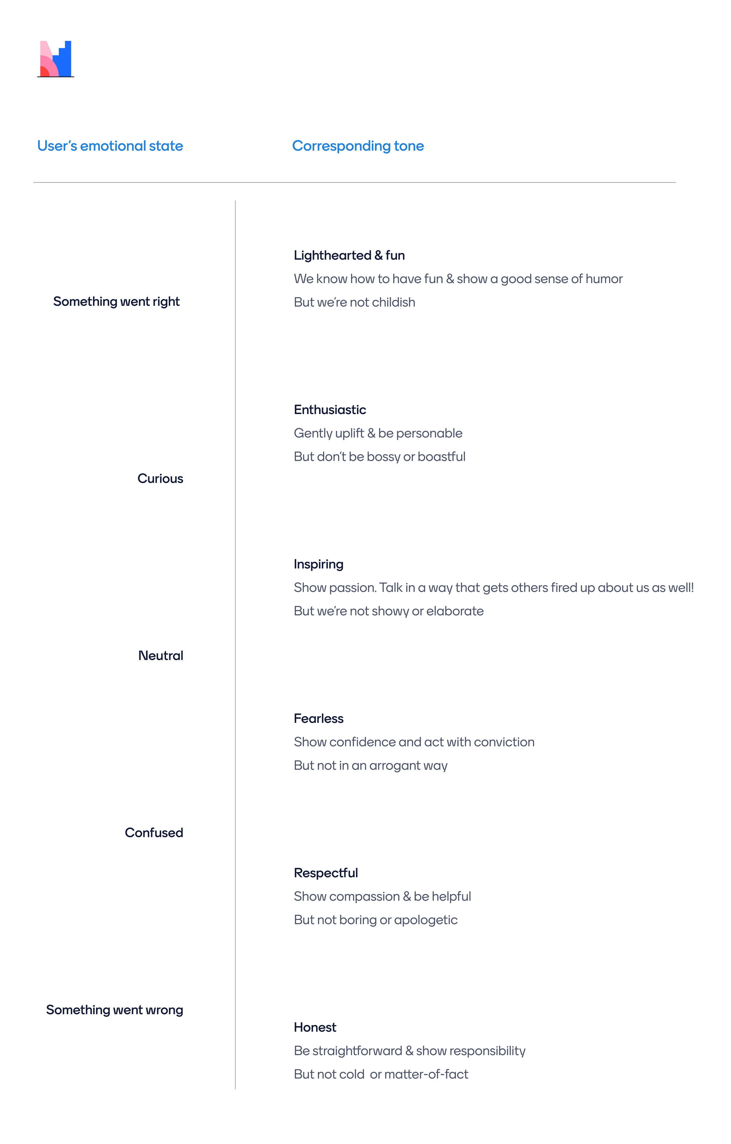
3. creating a tone map
Based on the company’s existing brand voice and user research, I created a tone map to help reflect the right mood when writing.
Encouraging conversion
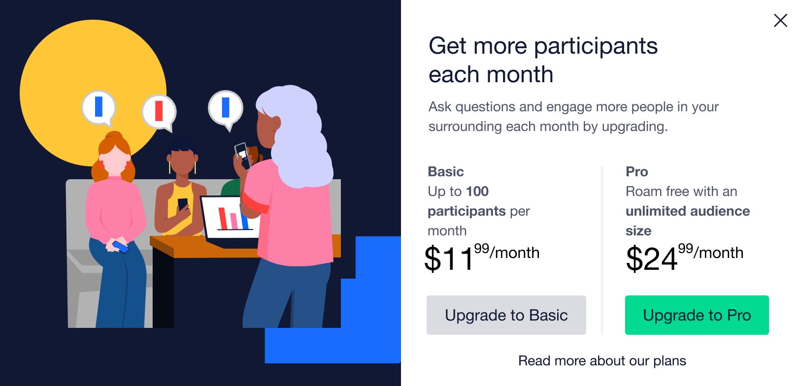
example 01
Brief
This project was set up as an experiment to test if users are willing to pay for presenting to a larger audience size.
Challenge
The end goal was to get the user to upgrade by convincing them that they couldn’t continue unless they upgrade (but we couldn’t explicitly say this as it's not technically accurate). This needed to be done responsibly, and in a way where we don't deceive the user so that we can still maintain their trust.
Process
I considered the user goal and where they currently are in the user journey.
This piece of comms went through a few copy iterations with feedback from the PM.
Solution
I took a few steps to reframe the message:
Captured the user value in the headline.
Removed copy that alludes to a paywall as this might raise more questions (e.g.: hosting your next presentation ‘above the plan’s limit’).
Framed the body copy so it focuses on the benefits of upgrading and empowers users to take the next step.
BEFORE

AFTER

example 02
Challenge
Encourage users to upgrade — more popups.
Solution
A) — Added a bar to visualise the monthly usage limit. This aims to reduce cognitive load from too much text on the screen.
B) — Made the headline emotionally-led and the body copy more functional.
A) BEFORE

A) AFTER

B) BEFORE
B) AFTER

Clarifying how to join and vote on a Menti
Brief
Users weren’t sure how to let participants join a presentation. Research also showed that they didn’t know that they could extend the code validity time.
Challenge
The challenge with this is that the entire Share modal needed a revamp but it was a little bit tricky because it crossed a few functional areas where no teams claimed ownership over. There were also a few design issues that needed to be addressed on a more holistic level. Therefore, I focused on some quick wins by updating the copy only. It was also an opportunity to promote the branding.
Process
Analysed the current UI and it became clear that the screen is quite cluttered and the navigation isn’t clear.
Conducted some qualitative user research in Google Analytics (GA) to determine popular search terms related to voting.
Updated the microcopy so it’s more succinct and has a consistent pattern.
Solution
Renamed the tabs so that they are more action-oriented and they now follow a consistent naming pattern:
Participation
Changed this to Join, which is a more commonly used search term based on GA.
Presentation sharing
Changed this to Download, which is more specific to what the user does within that tab.
Added a short description to provide context to the overarching purpose of this modal. By doing so, I was also able to remove a tooltip, which became redundant.
Renamed the lock/unlock label to Permission.
Renamed the voting code & link labels to Menti code and Menti link, respectively.
My first step was to use a parallel-naming structure for better scanability and renamed it to Voting code. After conducting some GA research, I found that more people searched for the term menti code. Therefore, I updated the label to match the search term. It would also promote the term ‘Menti’ from a branding perspective.Moved and renamed the Expand link to Extend.
By placing this link closer to the text “2 days”, the relationship between the validity period and the action you can take is clearer.
BEFORE

AFTER

Content design system guidelines
Challenge
There is currently no standard or guidelines on how to write for design components.
Solution
To help scale UX writing and create some consistency, I created some guidelines for common design components.