Project brief
Client: Hopper
Project type: App design concept
Team members: Hybrid:
Group work for the research;
Solo work on the design and prototype
Duration: 3 days research and testing + solo work on prototype
Overview
Conduct a usability and heuristic testing on Hopper.
Analyse the ease-of-use of booking and tracking online flights by using the Hopper app.
Research
When selecting the test subjects, we decided to test the app with 3 test participants, all of whom frequently book flights online or with an app.
Hypotheses
After initial analysis of the interface of Hopper, we came up with three hypotheses that we wanted to test during further research:
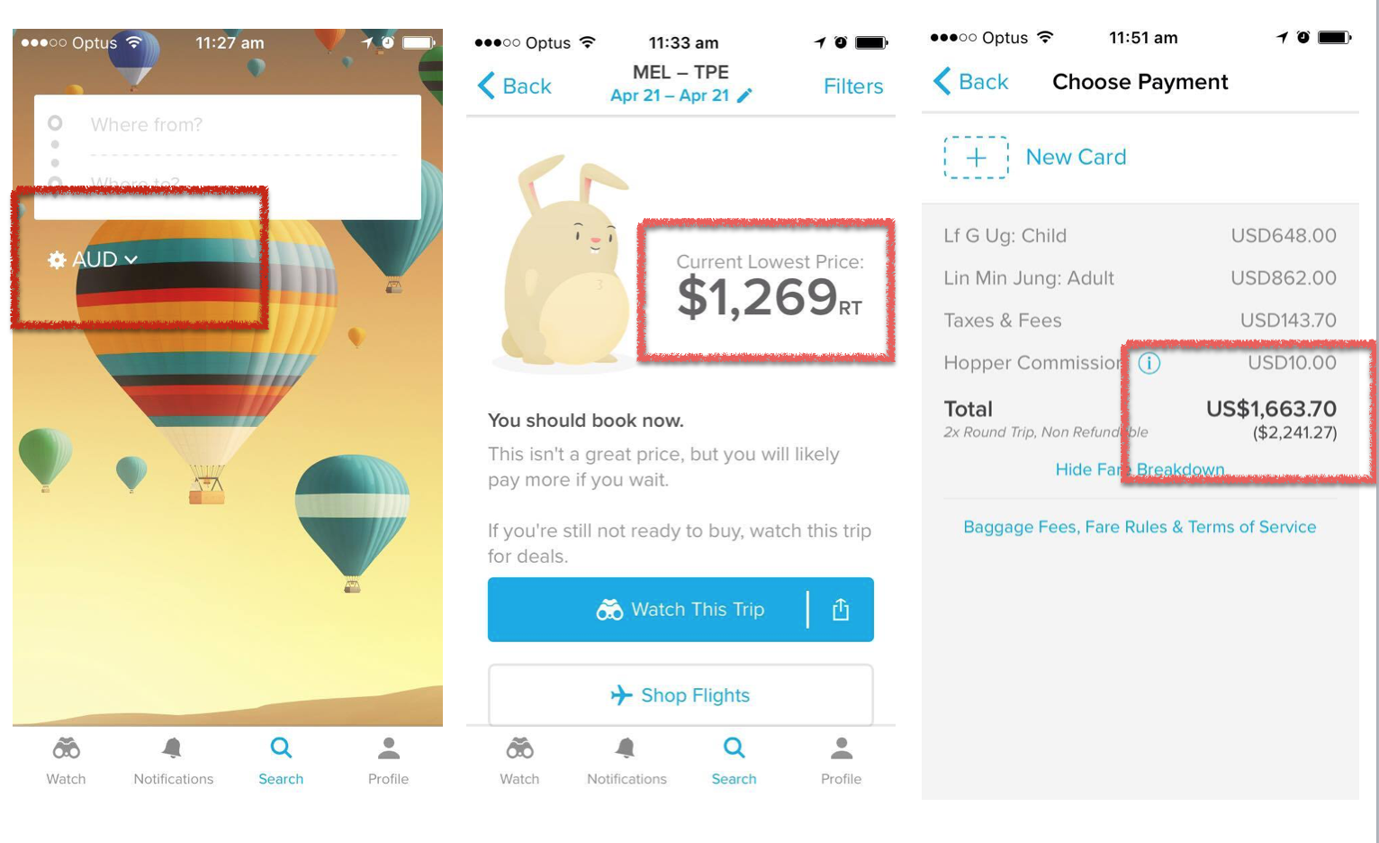
H1: Users will be confused about what currency is being displayed.
H2: Users will be confused about what “RT” listed after the price means.
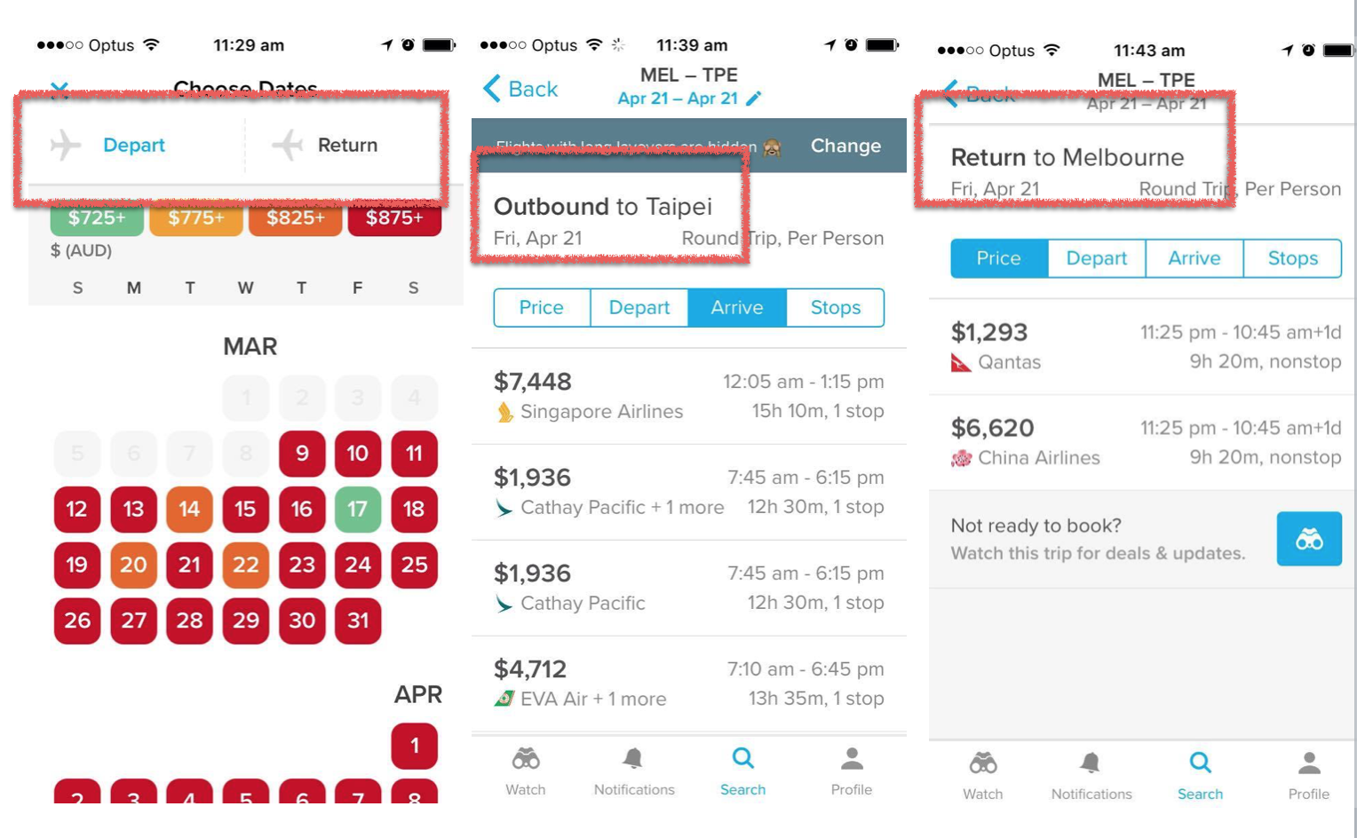
H3: Users will question which direction flight they’re looking at? (E.g. “Outbound” v. “Return”.)
H4: Users will question the sort bar - what does it do?
Based on the hypotheses, we came up with 4 use case scenarios that were the foundation of our testing script.
Scenarios and Tasks
Basing on our initial research and hypotheses, we’ve formed 4 test-scenarios and a set of tasks that were read and assigned to users during the test.
- Imagine that you need to go from Melbourne to Florence for a wedding, how would you find flights for this route?
- Imagine that there are a number of flights you will consider but you want the best price. How would you track those flights that you’ve chosen?
- Imagine that you went to consult with your partner about the flights and decided to come back to the app at a later time, how would you view the flights that you tracked before?
- Imagine that you are planning a long holiday but you’re unsure of when you’re coming back, how would go about booking a one-way flight from Sydney to Tokyo? (accomplished once reach sign up page)
Key findings
- Competitors that target market currently use: Skyscanner, Expedia, Webjet.
- Users aren’t convinced that the price displayed is the lowest.
- Users like the UI - colour coding is good, and hopping bunny is cute & memorable.
- Users are unsure about the Watch function and don’t necessarily need the function as their purpose is to compare the current price instead of future price.
user quotes
User 1
"I like the bunny rabbit. It's cute running across the screen."
User 2
"How do I know if it's accurate. What's the pricing based on?"
User 3
"It's easy to use. I generally know what I'm looking for."
Recommendations
- Maintain the currency from start to end (Home to Payment).
- Hypothesis: We expect users to be confused about what currency is being displayed.
- Evidence: We assumed currency would be AUD as per home screen, but at payment showed USD.
- Place the text RT so that it's not so close to the price in order to differentiate it, and spell it out in full; i.e Return Trip.
- Hypothesis: We expect users to be confused about what RT listed after the price means.
- Evidence: The meaning of RT was questioned 4 times on the trip screen. Users thought it was a currency type.
- Remove the text Outbound and create a header that shows TO and FROM; e.g. MEL to FLO as fixed header (don't lose in the scroll).
- Hypothesis: We expect users to question which direction flight they're looking at (e.g. Outbound vs Return).
- Evidence: Users were unsure of which flight they were looking at, one couldn't proceed further without explanation of the term Outbound.
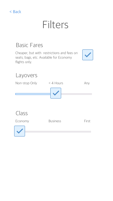
- Remove current bar, and replace with a drop-down menu item which is labelled more clearly. E.g. Sort By or sort icon. Within the drop-down menu, give options to choose between sorting by ascending or descending values (and labelled accordingly). E.g. PRICE (lowest to highest).
- Hypothesis: We expect users to question the sort bar - what does it do?
- Evidence: The Sort bar was not obvious as a clickable bar to users, when they clicked they didn't know what it would do. Some users wanted a filter option.
- Remove the Watch function in this instance to encourage users to book the flight now
- Hypothesis: A watch function may hinder users to use the book function.
- Evidence: There is an option to Watch when shopping flights even though they've been prompted to book now (or risk paying more later).
1. The currency type is inconsistent.
2. The label "RT" is confusing
3. The terms Outbound and Return is unclear
User Flow
current user flow
proposed user flow
Prototyping & Testing
Wireframing
#
prototypes
#
test sessions
Version 1
Redesign focus:
- Make changes to UI as per usability test findings.
Version 2
List of changes from first round of testing:
Final version
List of changes from second round of testing


