

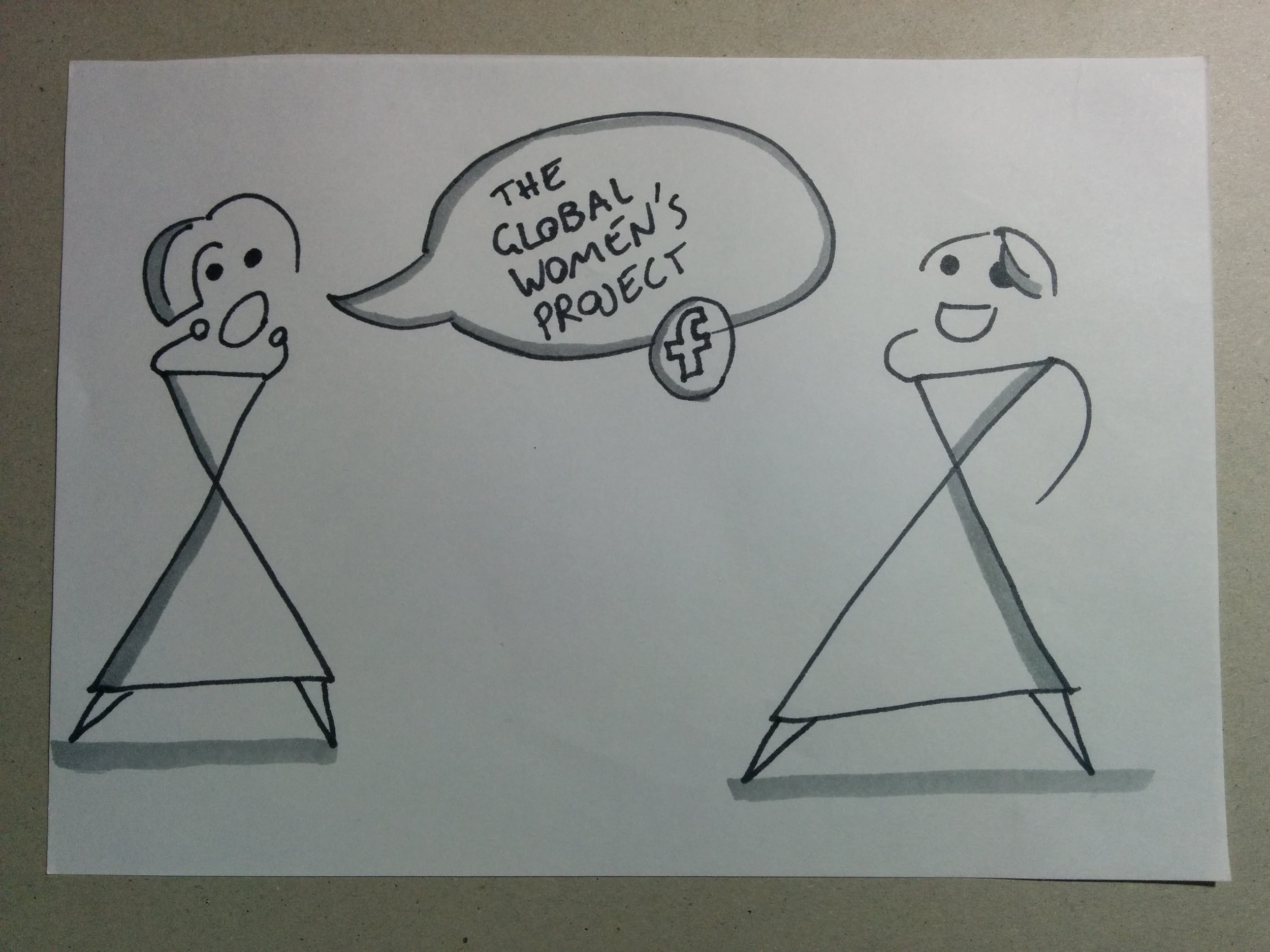
Global Women's Project
The Global Women’s Project (GWP) is a non-profit organisation based in Melbourne dedicated to creating a gender equal world.
Project brief
Client: Global Women's Project
Project type: Website redesign
Team members: 4 UX designers
Duration: 2.5 weeks
Overview
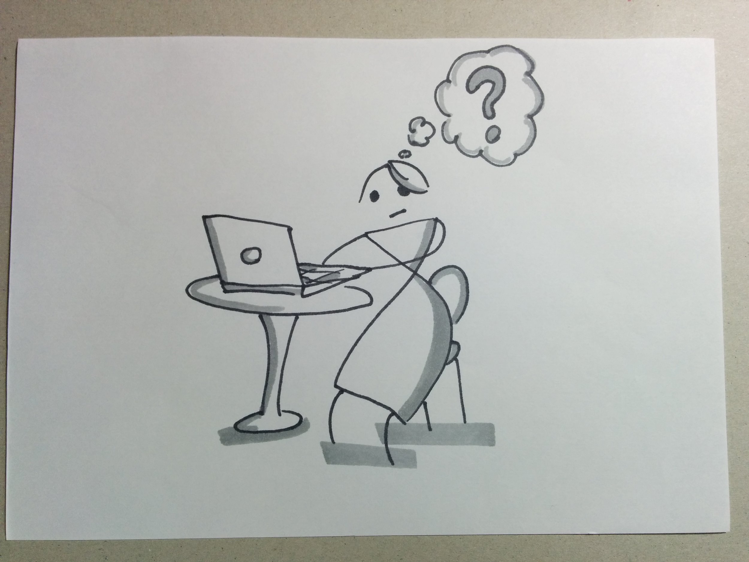
In March 2017, GWP approached us to help them improve their existing website so that it attracts more donors and donations.
Challenge
Our challenge was to redesign the website in an already saturated industry dominated by much larger & well- established organisations.
My role
As part of the UX team servicing to GWP, I was involved in the end-to-end process that delivered the experience strategy and website redesign.
I worked alongside 3 other team members and my role, specifically, includes:
- Communicated with the stakeholders
- Conducted user research
- Affinity mapping
- Defined the problem statement
- Defined the hypothesis
- Participated in a Design studio session
- Created the information architecture
- Built the wireframes & prototypes (specifically the home page)
- Led the documentation
- Presented the solution to the client

The process
The UX Design Thinking process was used for the project from end-to-end. A high-level breakdown of what we did in each phase is described below:
Empathy
Met with the stakeholders to to gain a better insight into their organisation, users, & objectives to uncover potential problems areas we should focus on. Conducted various research to obtain information from the users: user interviews, surveys, affinity mapping, & competitive analysis.
Define
We synthesised the research data into meaningful insights we could work with. In this stage, we defined the problem statement, hypothesis, and solution statement.
Ideate
Brainstormed to generate ideas for the new design. Tasks within this stage includes: information architecture, card sorting, user flow, site map, concept map, and content strategy.
Prototype
Designed the wireframes and prototypes that would enabled us to iterate the designs after testing: design studio, paper sketches, wireframes, and clickable prototype
Test
Testing the prototypes enabled us to validate our designs and assumptions.
Research

Key findings - User survey
Less than 15% of our respondents know about GWP.
The average donation is between $10 - $50.
- Information about how the fund is allocated is very important for users.
- The presence of an online store for users is of low to medium importance.
- Users preferred to be updated about their charity on a monthly or quarterly basis.
1 week, 5 methods
We spent about a week gathering data for the analysis. We believed that is was important to gain insights into the user’s attitudes and focussed our research on interviews and surveys.
We used the following research methods to gather data:
- User interview
- User survey
- One-click test
- Affinity mapping
- Competitive analysis
Key findings - comp analysis
- The Donate button is not on the homepage.
- There is no link to the Store on the main site; the online store is accessed from the
- trailblazingwomen.com.au website.
- There is no information about current campaigns running.
- There is no information about financials.
- There is no Search function
Real people, real problems

““I trust the people who ask me for donation””
“I like to see feedback and evidence of on the grounds help, and that the money is actually doing something”

“First we check if the place is legitimate. There are scammers who only want to take you money and we want to make sure the place is real”

Images courtesy of Flaticon
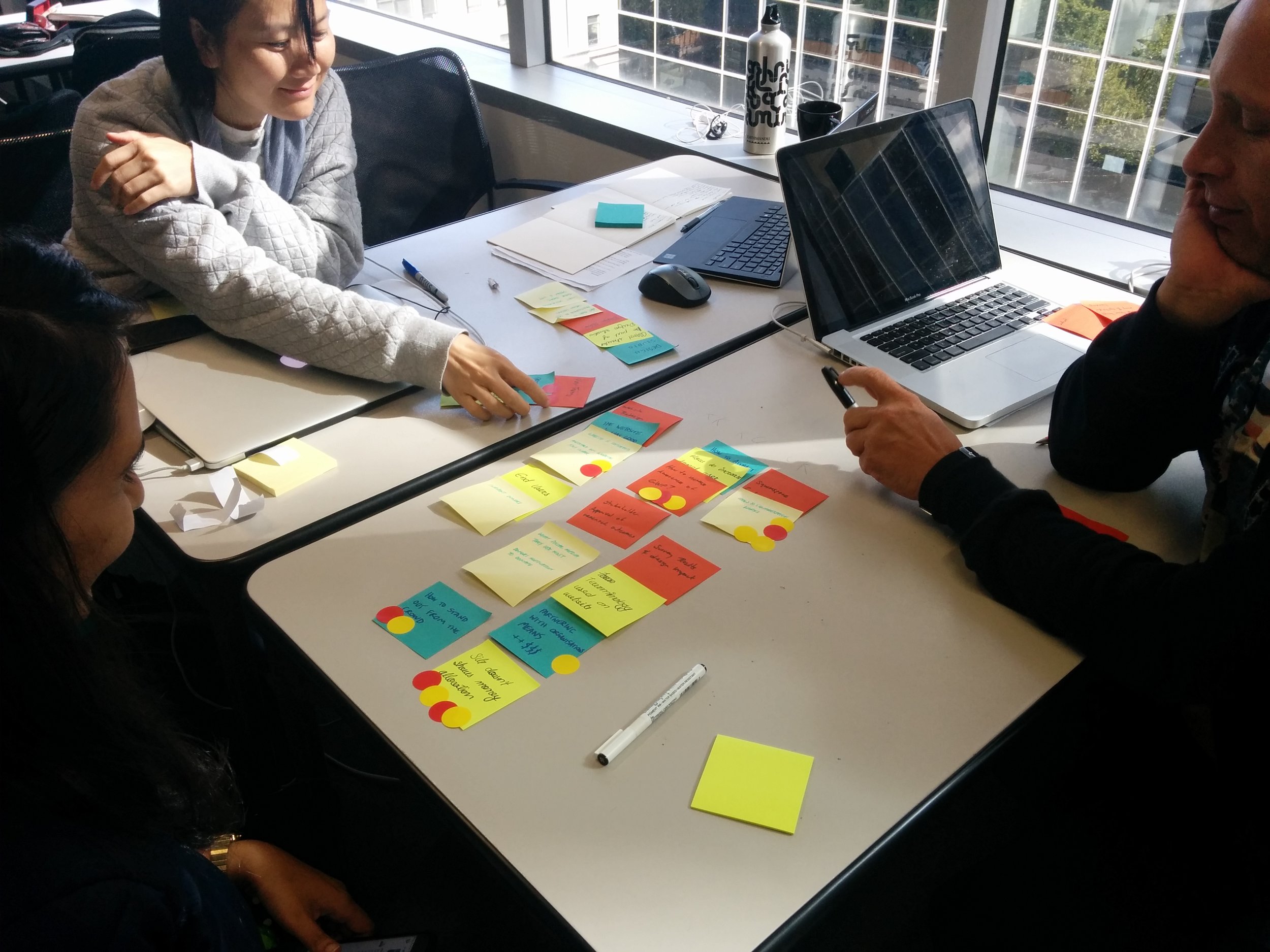
Affinity mapping

By carefully analysing the results from the affinity mapping exercise, 3 main themes stood out to us which we felt were important to address in the problem statement:
Trust
Confidence and trust in an organisation
Allocation
Knowing their donation is going where they want it to go
Impact
Empathy for the cause & seeing they are having an impact
Problem statement
The definition phase took some time, insight, and iterations.
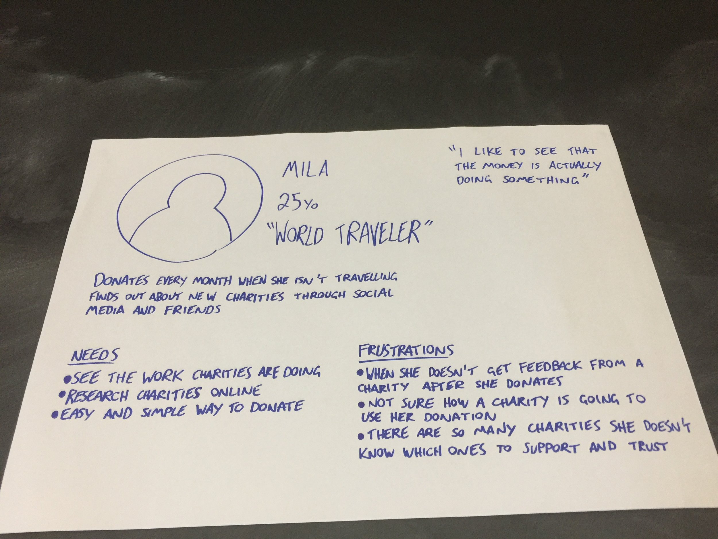
By balancing the business goals and by looking at the major issues discovered from our user research, I created a few versions of the problem statement which were mostly centred around trust. As a team, we collated all the versions and formulated problem a statement that represents the core issue faced by GWP in this brief:
“Mila needs to trust and have a clear understanding of GWP’s cause because she wants to feel confident donating her money.”
HMW's
We then moved onto identifying opportunities from our problems by using How Might We’s (HMW’s).
“HMW...Personally engage people with our cause?
HMW...Tell a story and build empathy?
HMW...Clearly present who The Global Womens Project are as an organisation?
HMW...Show donors how we made a change?
HMW...Build online trust with new donors?”
Hypothesis
In the next step, we created a hypothesis that validates our problem statement
“We believe that by highlighting GWP’s programs and impact online we will provide clearer organisation goals, increase empathy to our cause and encourage a greater number of new visitors to support our cause.
We will know this to be true when we see a 20% increase in the number of donors within 3 months.”
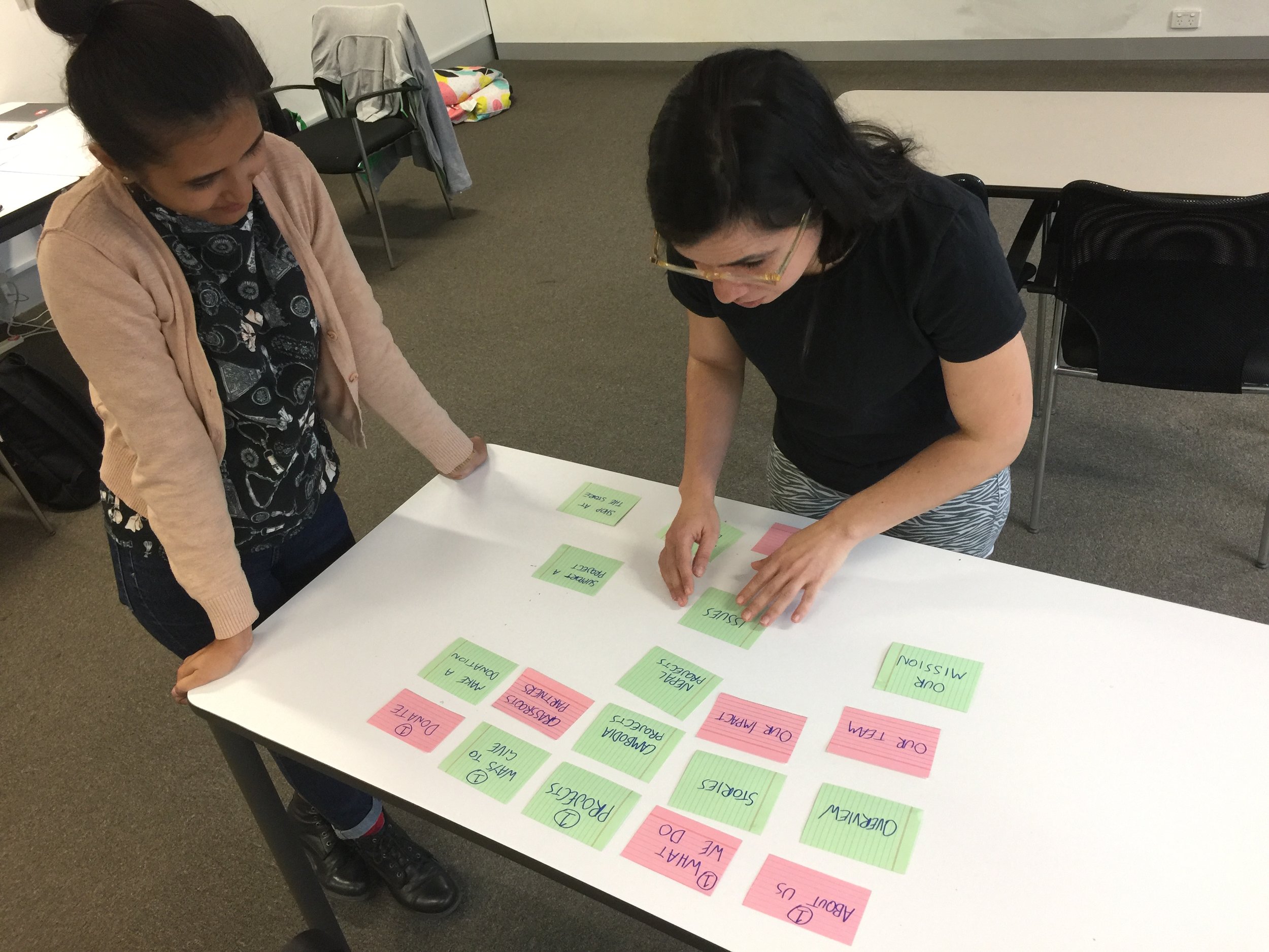
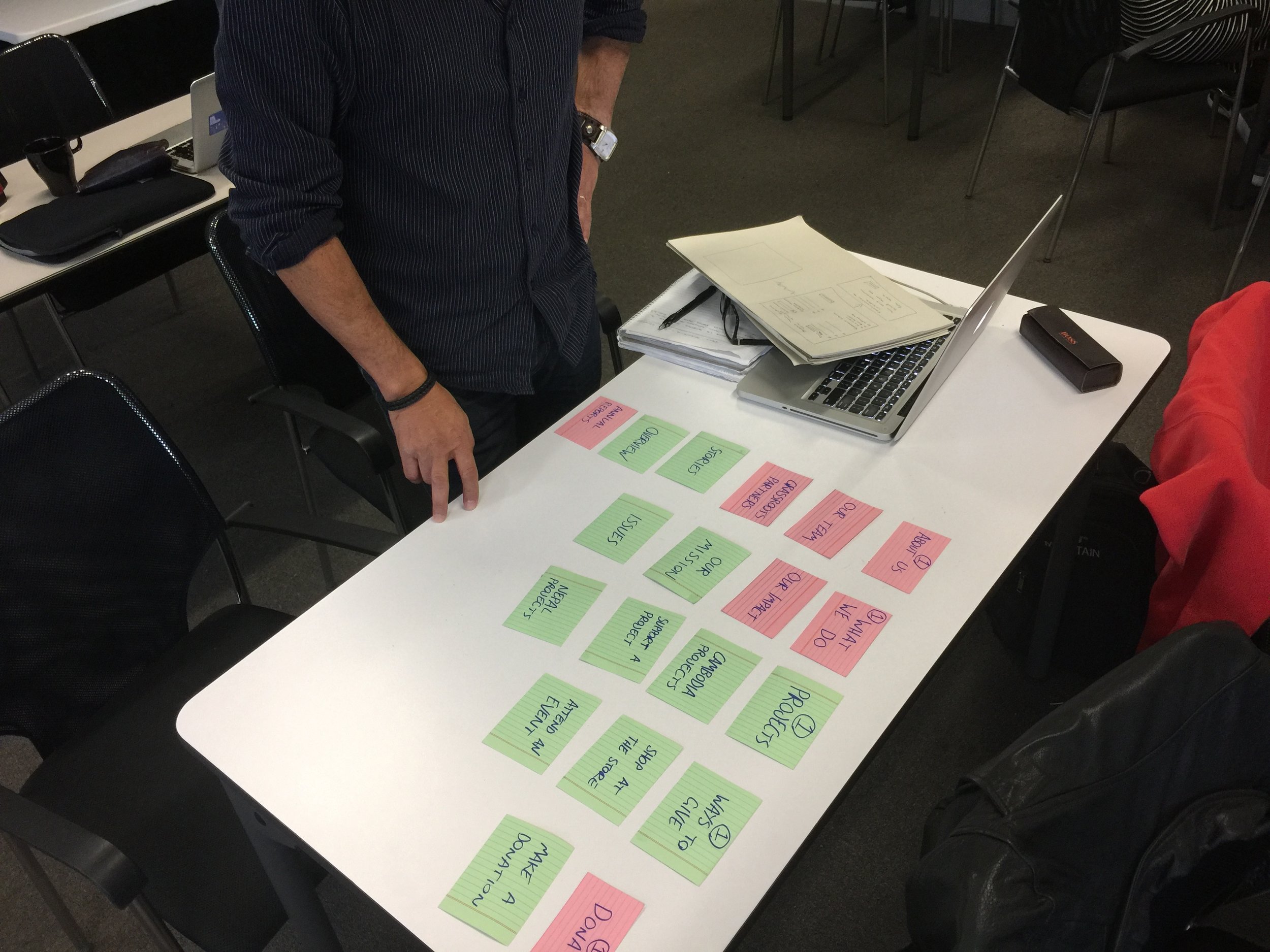
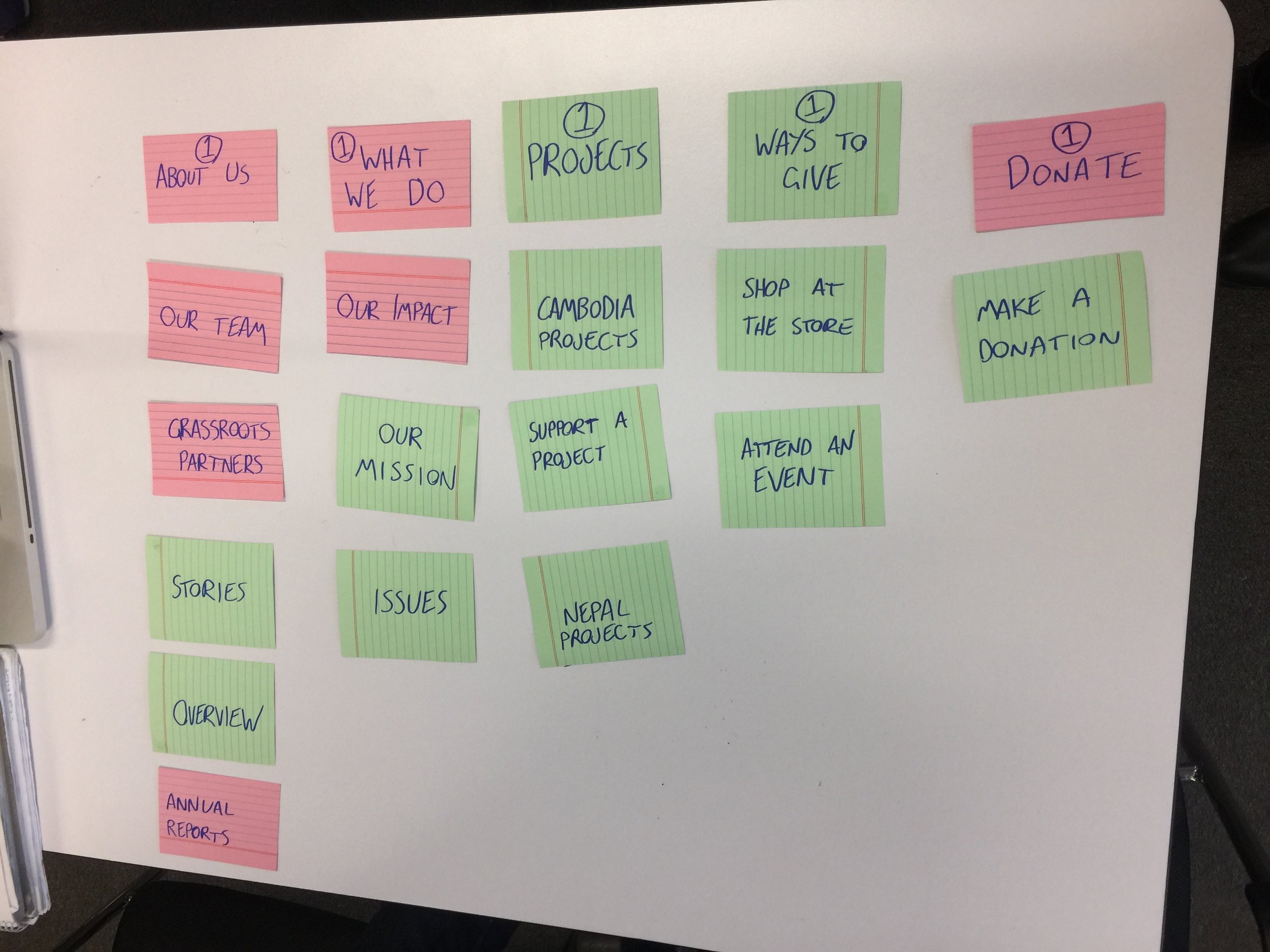
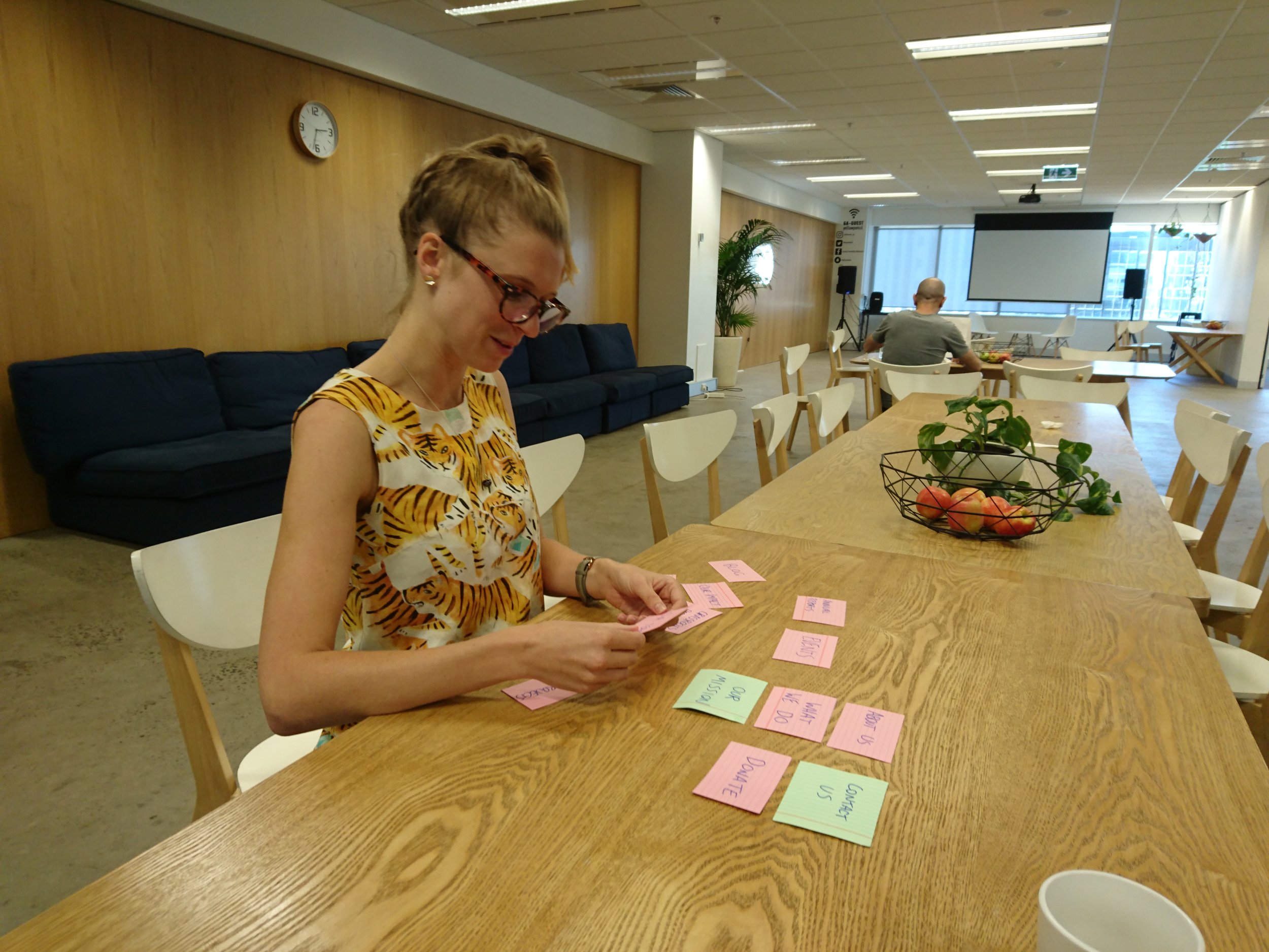
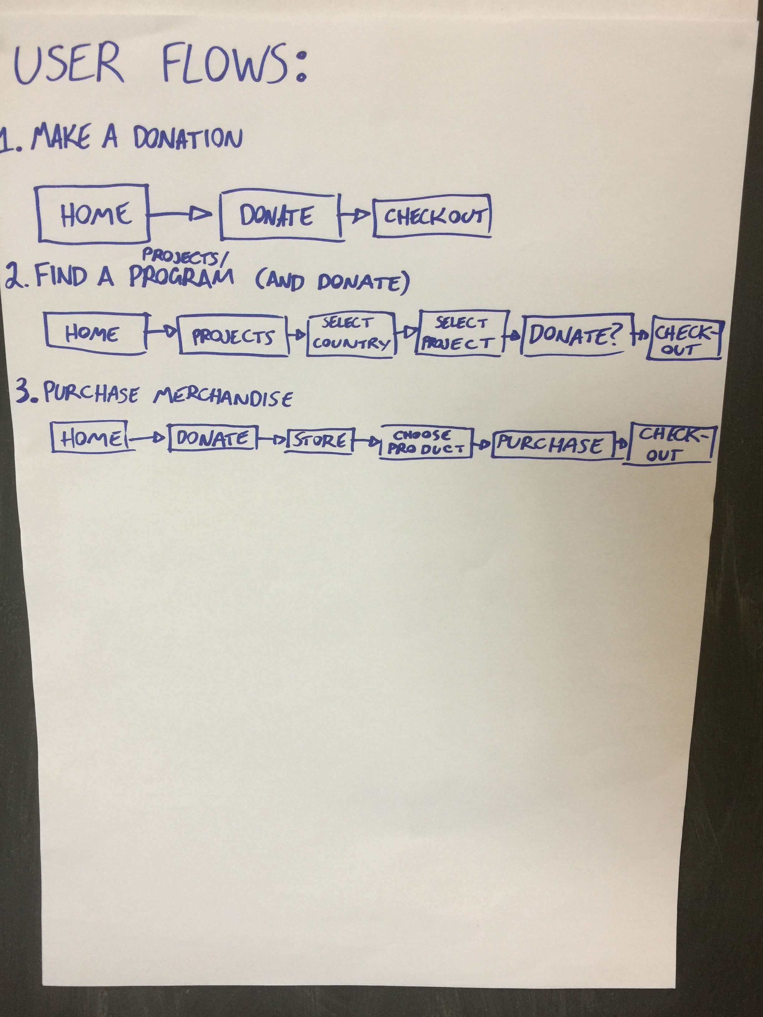
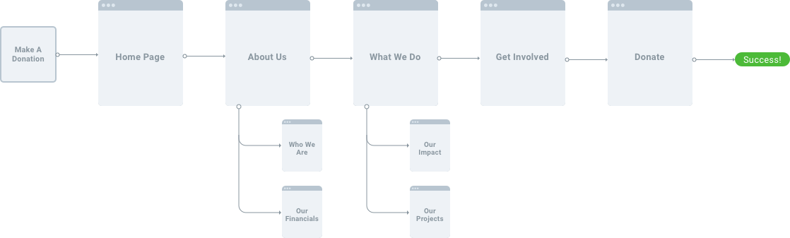
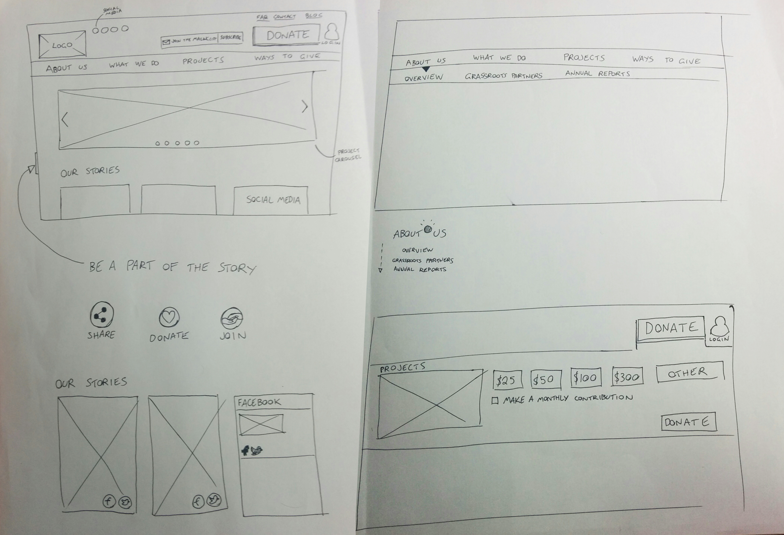
Information architecture
Card sorting
A card sorting exercise was conducted to help provide input on how the site should be structured. The exercise helps us understand how users group and categorise the content of the existing website & proposed website.
A combination of open card sort and closed card sort was conducted to refine the structure of the sitemap.
Key findings
- 4 users struggled with the term “Grassroots Partners” and did not clearly understand under which label to place this information category.
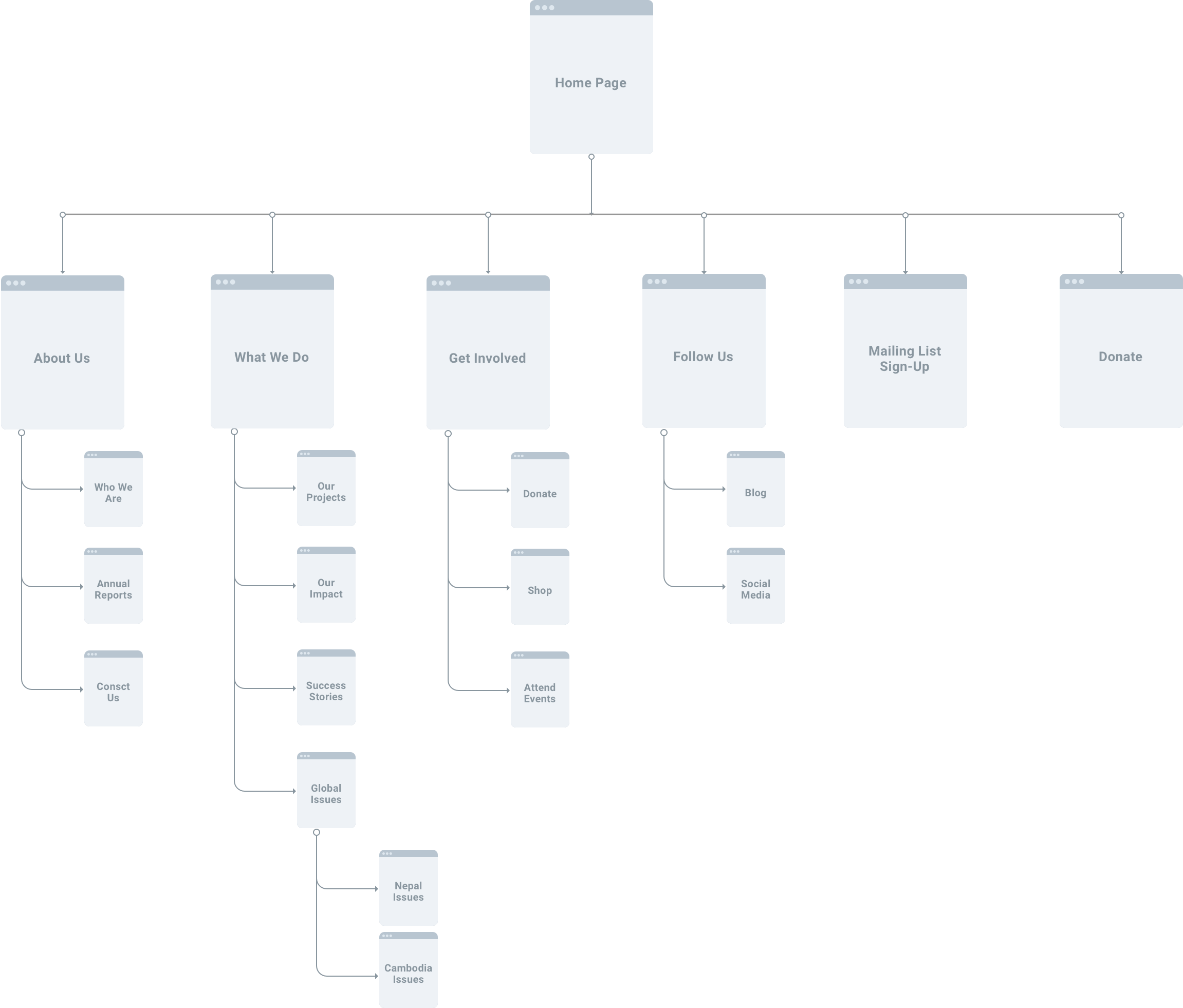
Sitemap
Based on this information, I created the information architecture for the website.
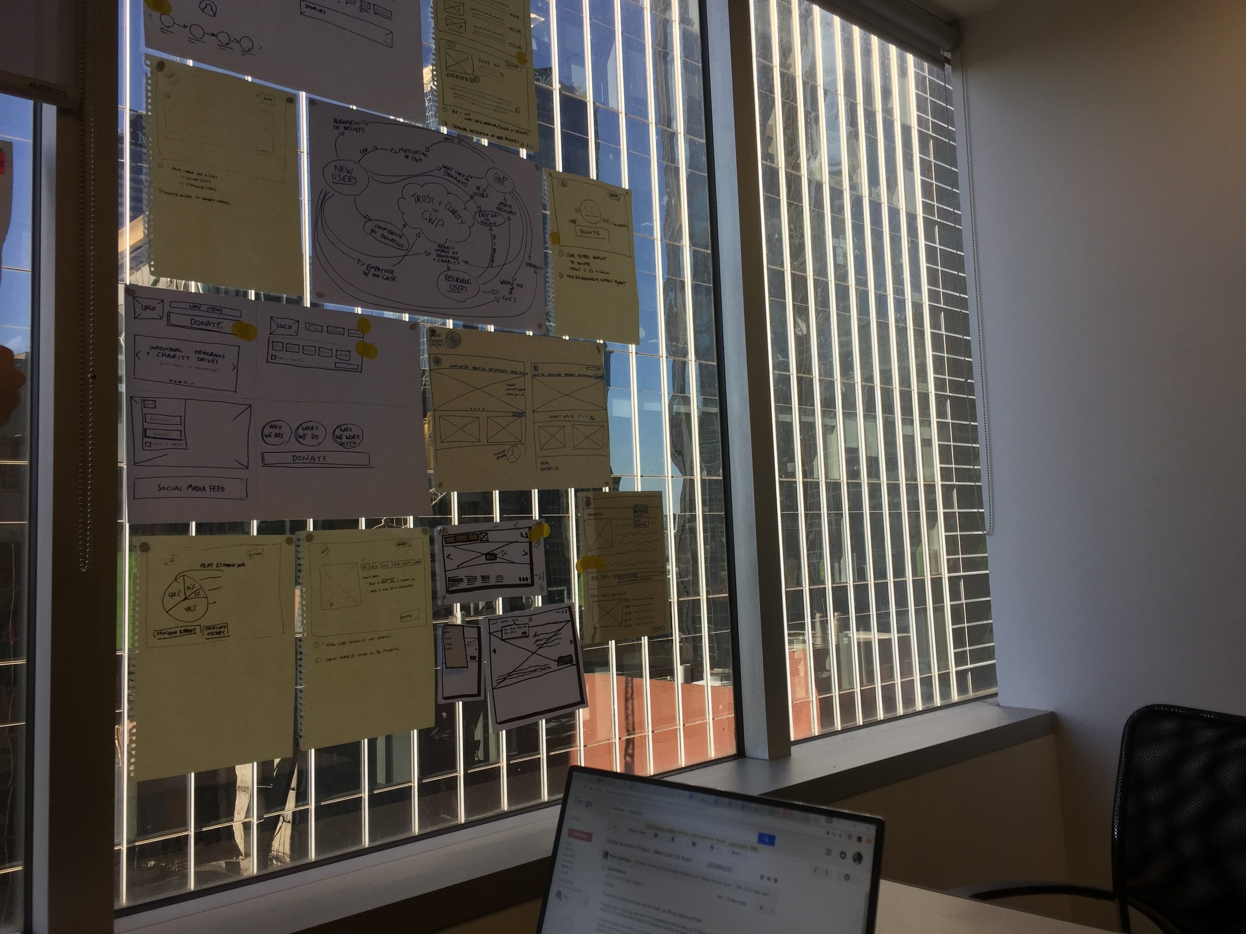
Ideate
“No limits. No rules. Collaborative designs.”
The ideate phase was creative and interactive. We used various methods — such as concept mapping, design studio, storyboarding, user journey, & user flow — to generate ideas for a solution.
We used a Concept Map to help illustrate relationships between ideas.
Specifically for GWP, we wanted clarity on how we could:
- Incorporate Trust & Clarity into our solution?
- Link all the moving concepts so that it can form a comprehensive solution?
Concept map
Key Considerations
GWP needs greater visibility
New visitors need to see that they can trust GWP
Returning donors need to see how their donations are helping
The donation process needs to be quick and easy
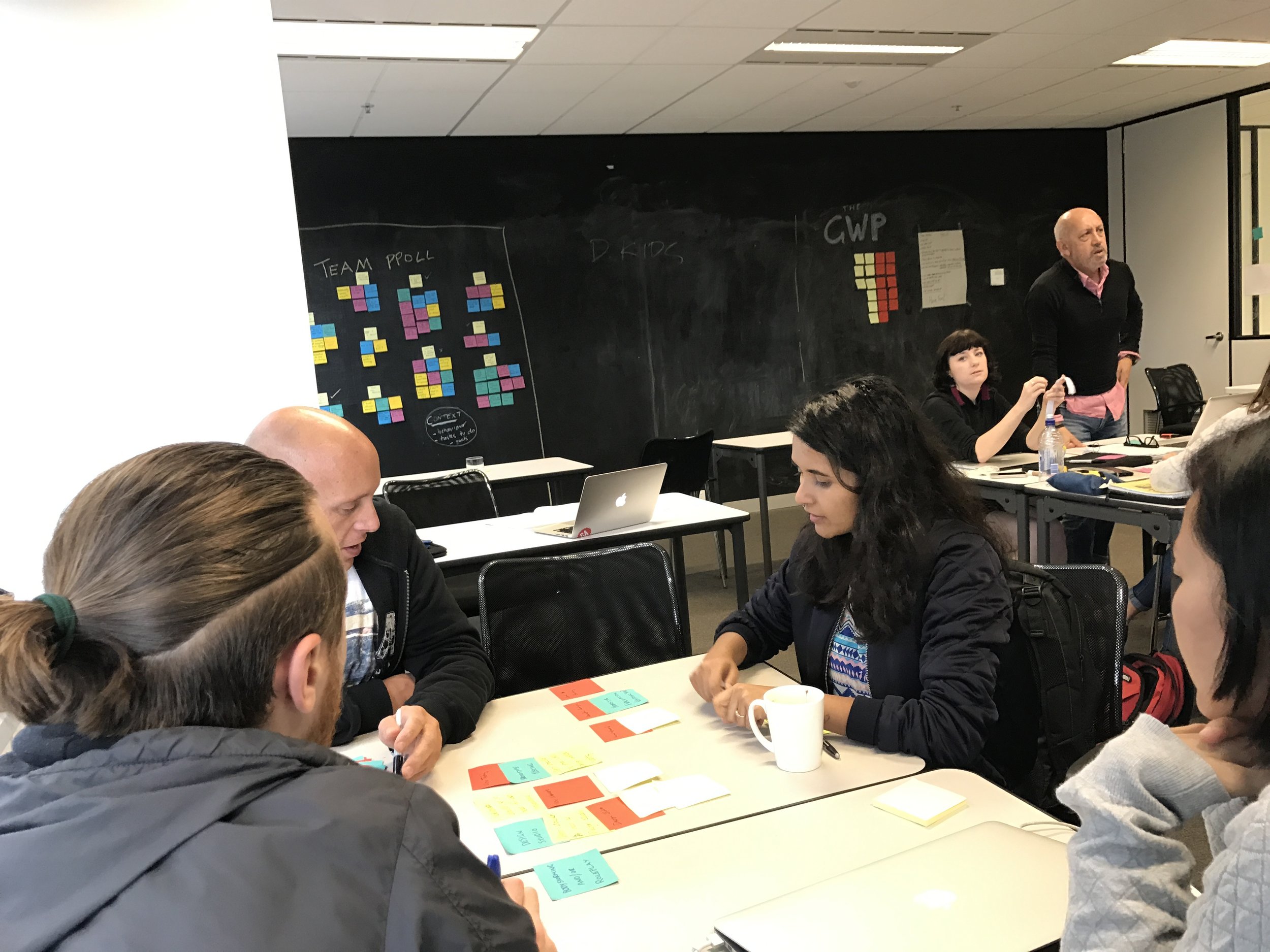
Design studio
“A quick & dirty way to generate ideas”
Participating in an 8-minute Design studio session allowed us to quickly conceptualise features for the website: what we envision the website would look like & what features to include.
By dot-voting on the features and designs we felt were important, we discovered the following ideas which might be used in future iterations:
- Dynamic donation panel or “mega-menu”
- Donor profiles that track individual contribution history
- Detailed program pages
- Promotion on social media
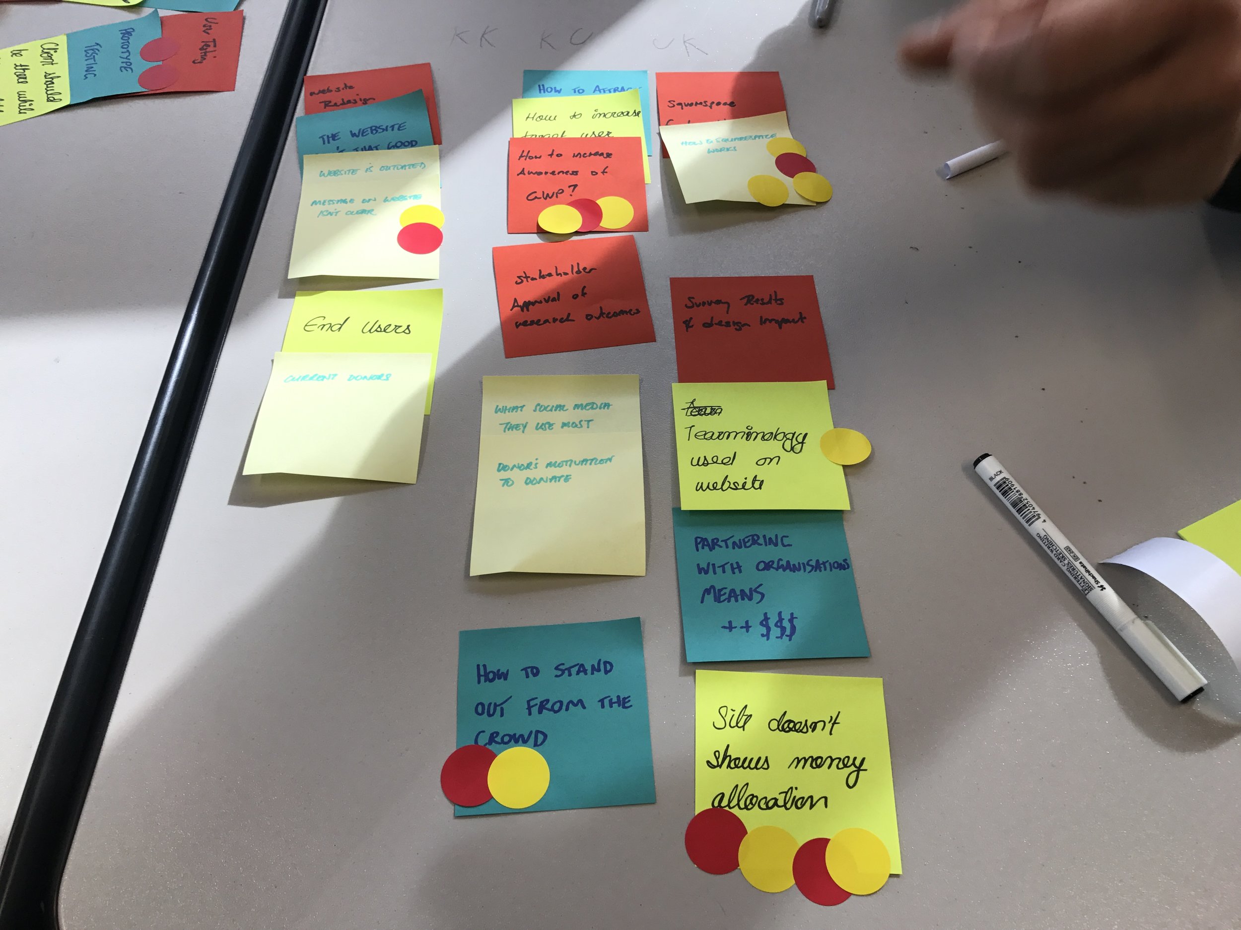
Feature priority matrix
We created a priority matrix to help prioritise features for the product. We mapped the features based on effort vs benefit.
We asked questions like:

How high value is this to GWP’s vision & business?
Would this bring in additional audience or revenue?
Based on our research, how important is this to users — how did users rate this feature in our user survey?
How much development work would it take to implement this feature?
Would additional research be required?
MVP
Once we mapped the features into the priority matrix, we used this information to select the features to include in the MVP, and then ultimately the final (ideal) version.
Those features that fell into the High Benefit/Low Effort quadrant were considered valuable and feasible enough to include in the MVP.
These include:
- Donate button
- Social Media feed
- Grassroots Partners
- Our mission
- Share buttons
- Events
- FAQ
Prototyping & Testing
Wireframing
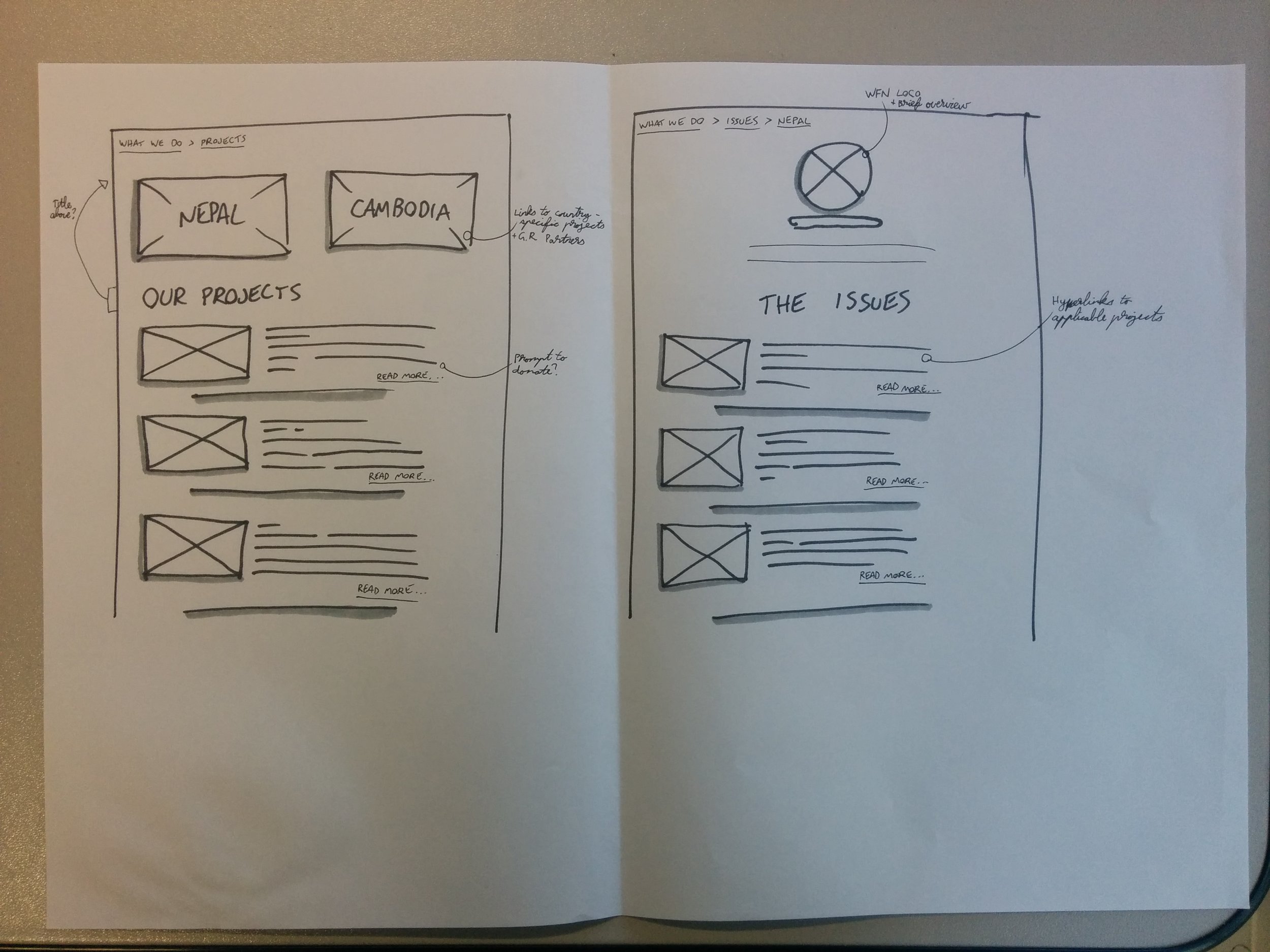
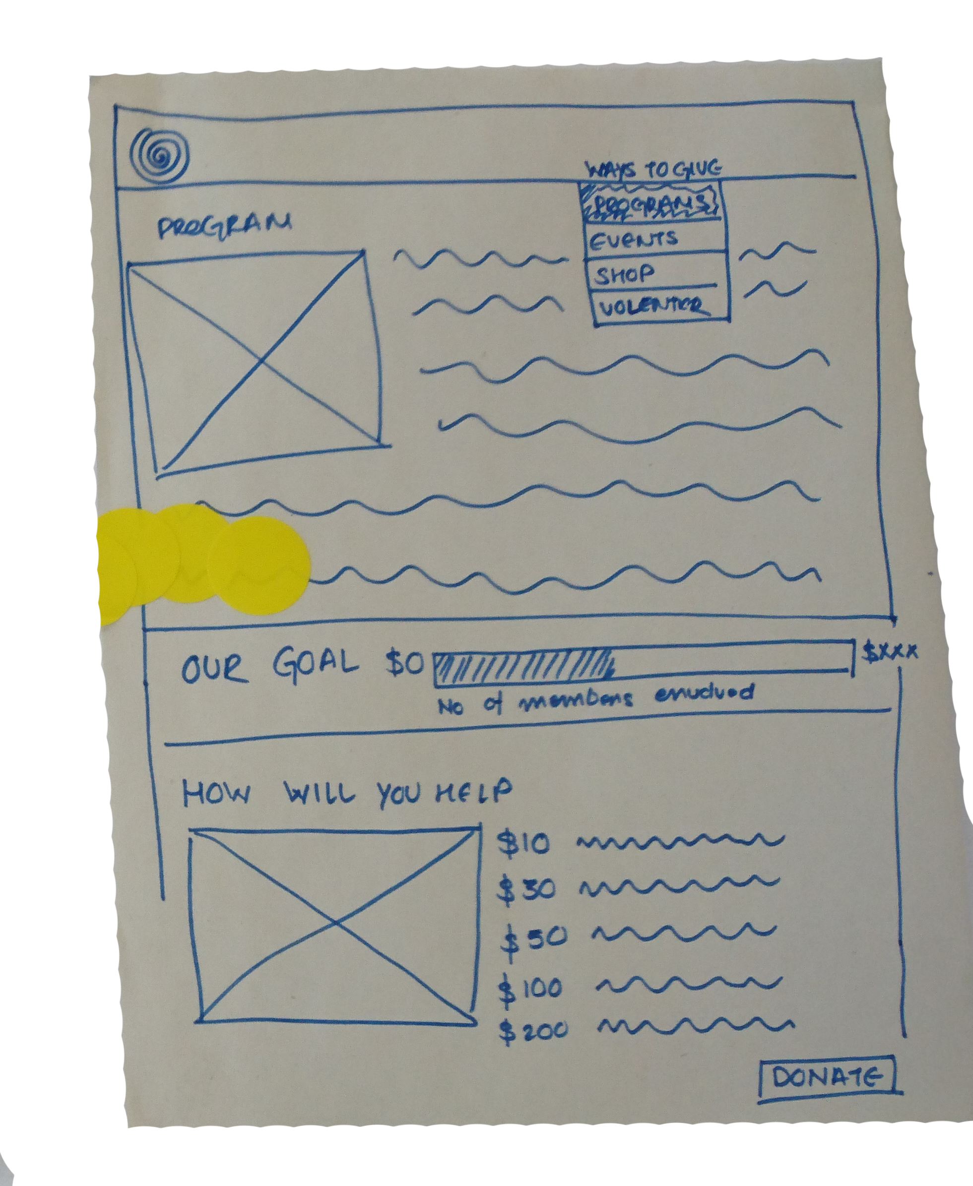
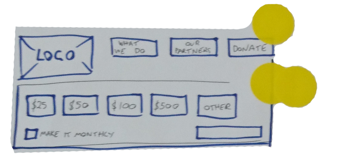
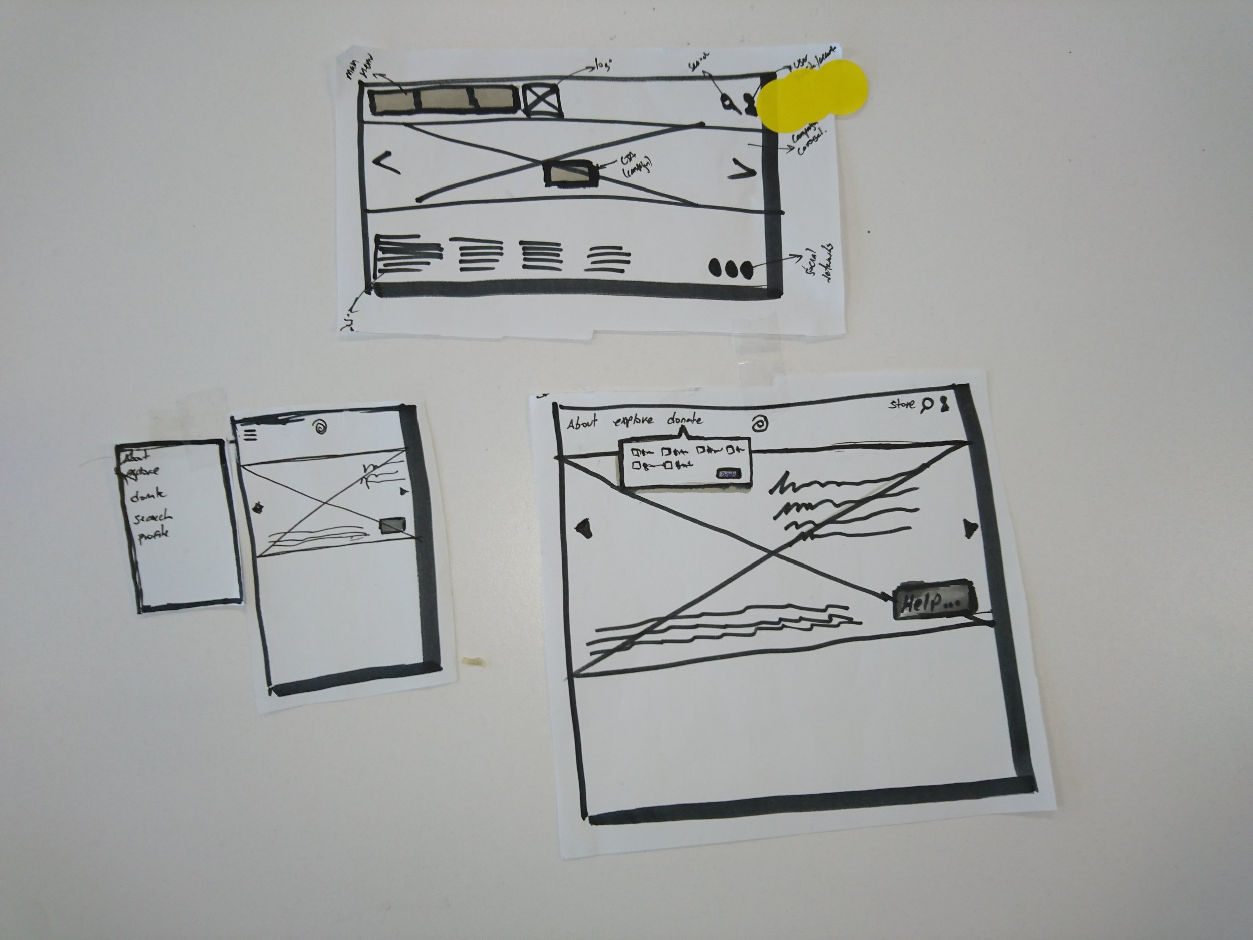
Pen & paper were the chosen tools of choice for creating the wireframes. This allowed each of us to quickly communicate our ideas.
Key takeaways
From our testing, the website could improve on:
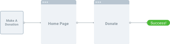
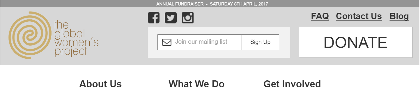
- The Donate button needs to be featured prominently on the front page.
- The process to donate must be clear and simple.
- Users found it challenging to locate the donation feature.
- More than 20% of users weren’t able to logically and easily find the GWP initiatives.
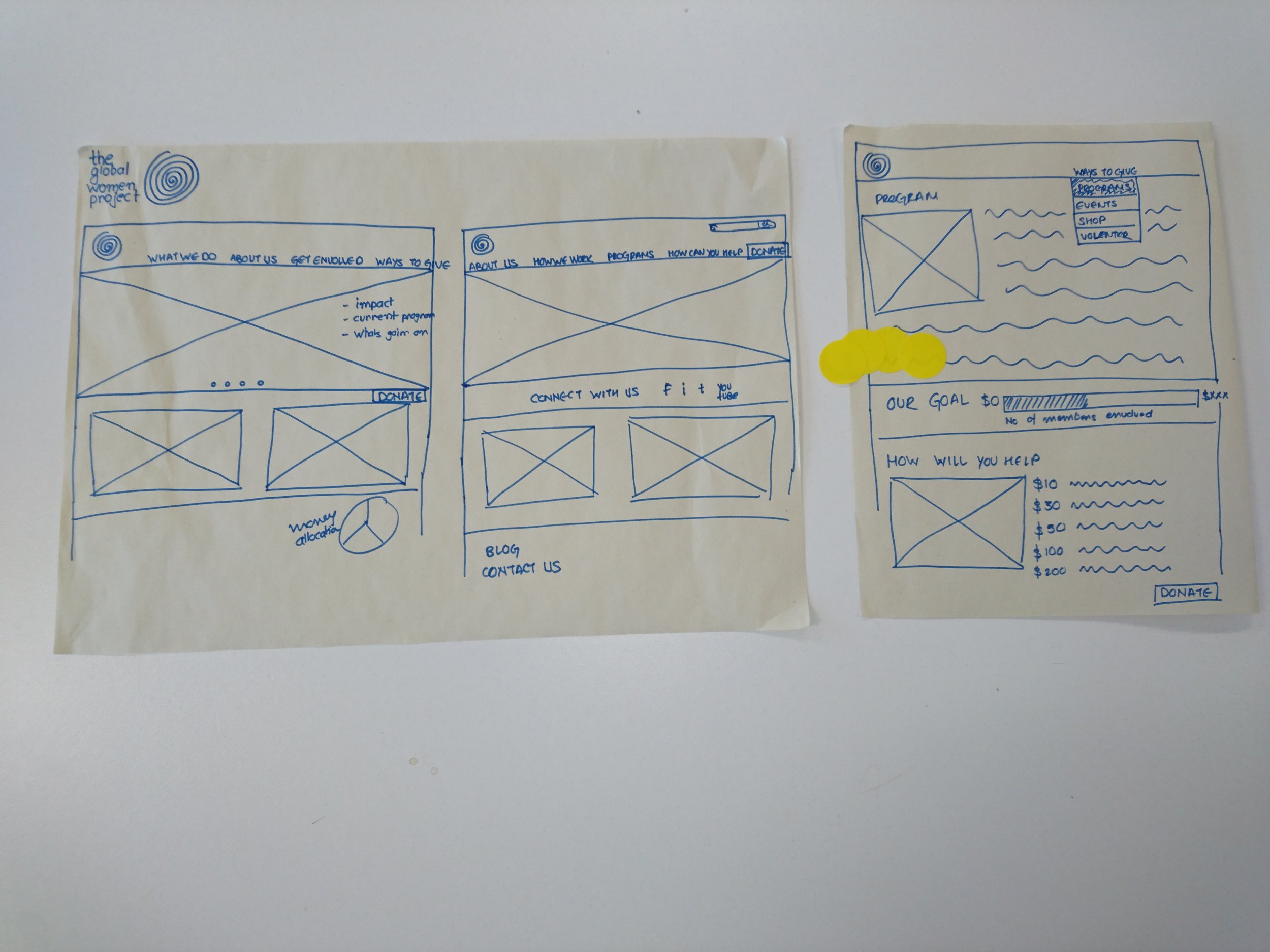
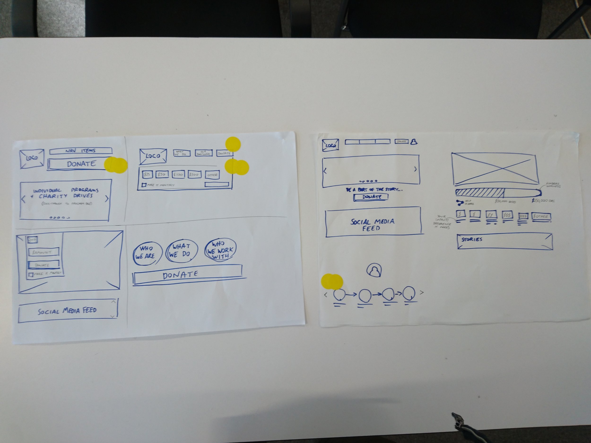
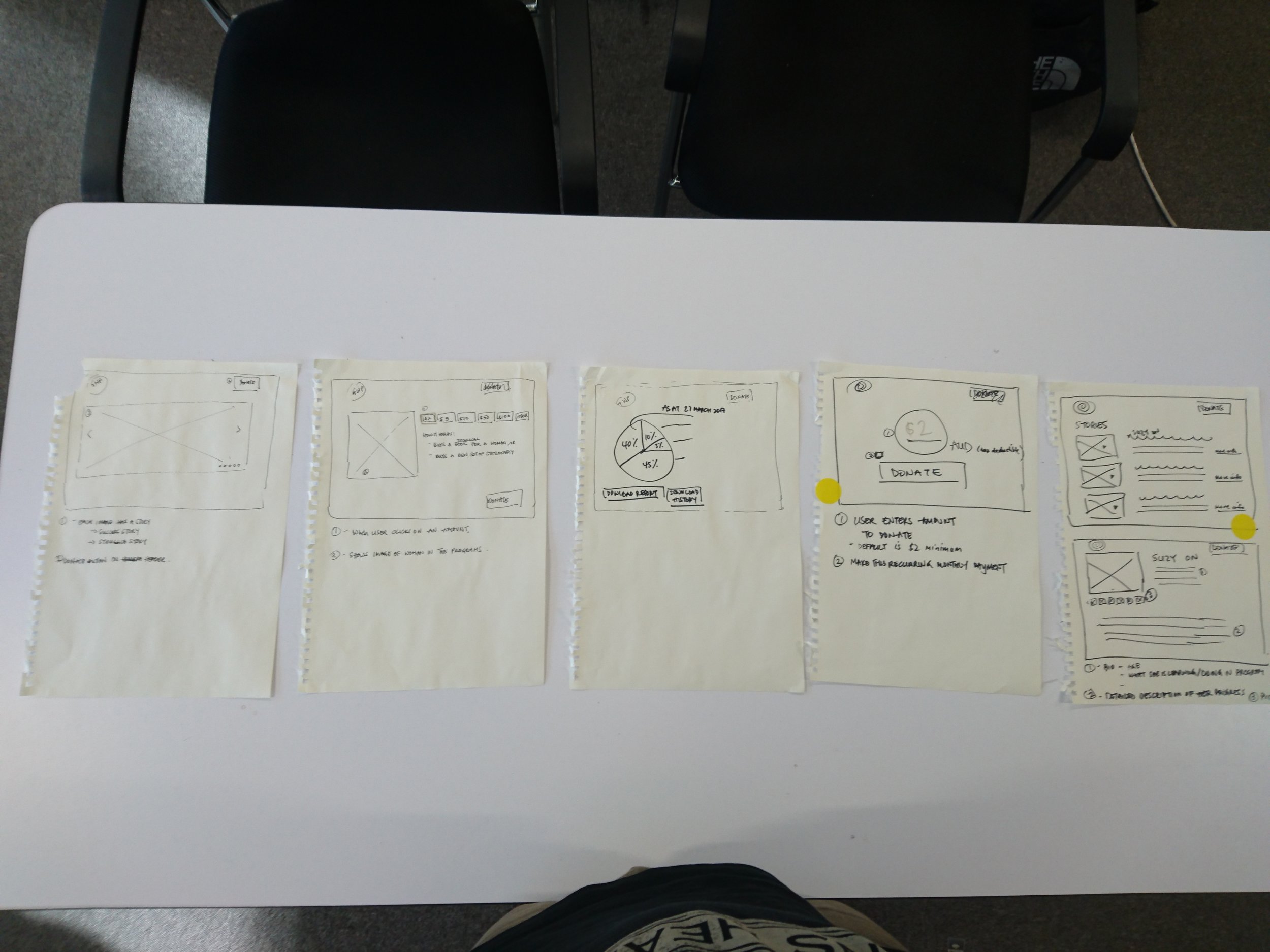
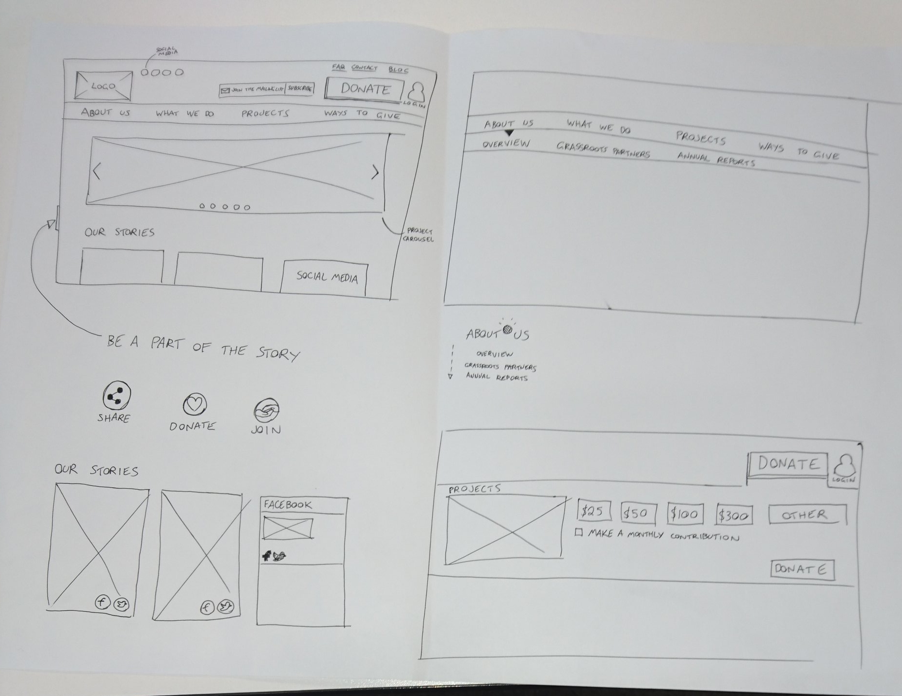
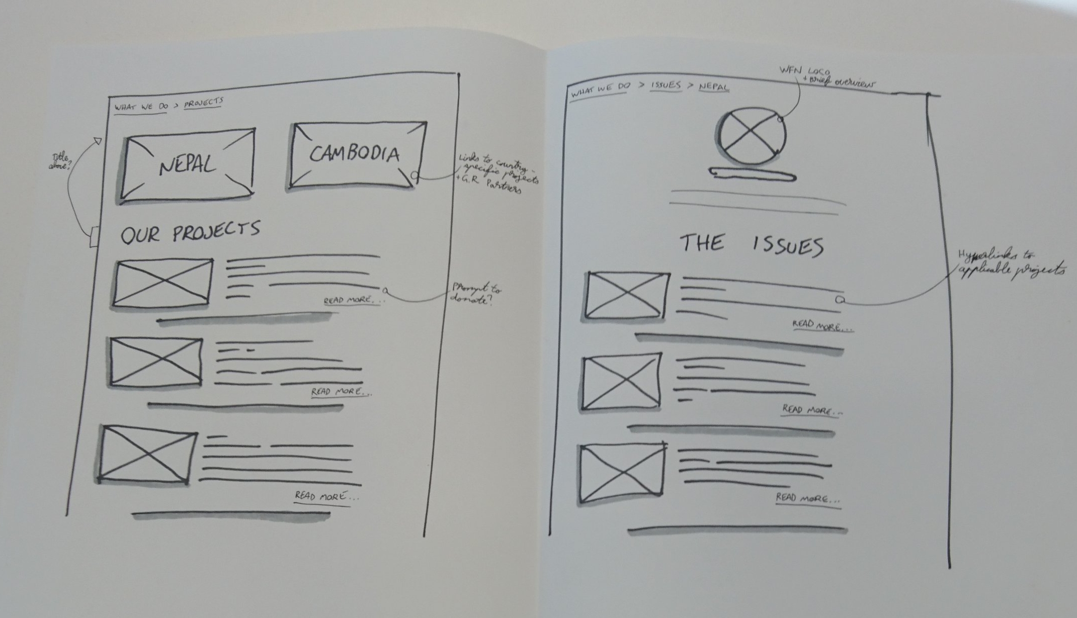
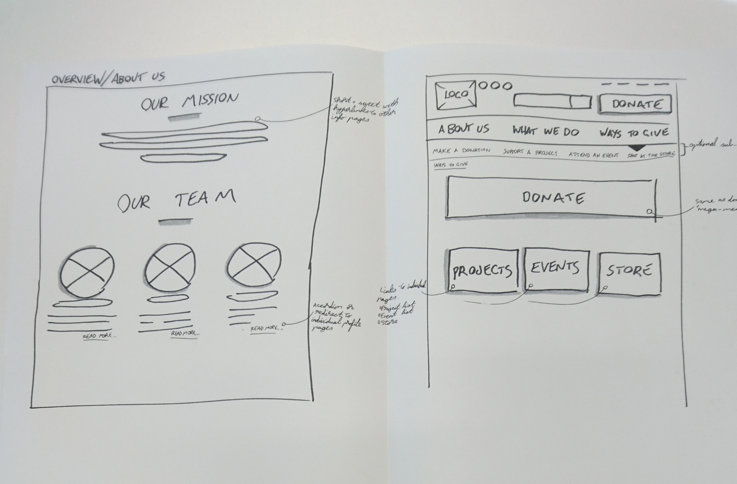
Testing & iteration
We tested the wireframes, and then further developed the concepts into digital prototypes.
For the prototype creation, I focussed on creating the template for the website and the homepage.
Key Findings:
- Validated that users try to learn about who the organisation is, and what they do.
- There was still some confusion about About Us and What We Do and how they differed.
- The term Make A Difference was considered vague, users weren’t sure if it was them who could make the difference personally, or just the organisation.
Digital prototype
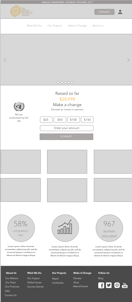
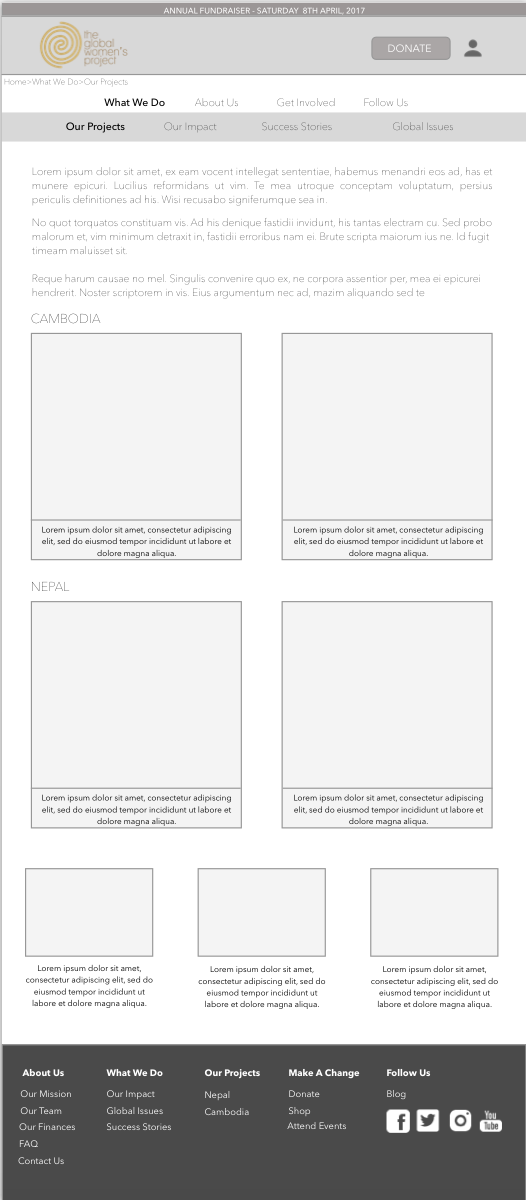
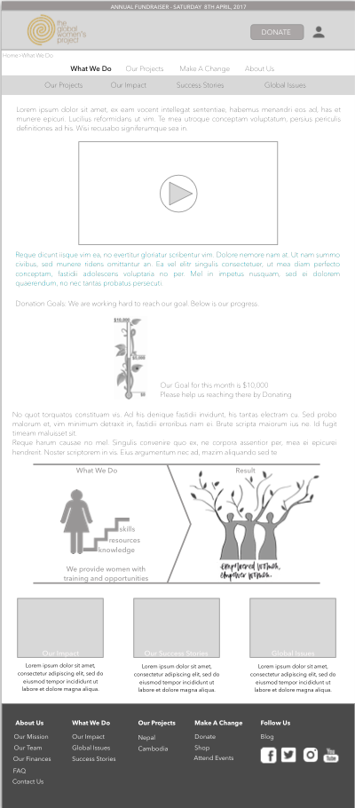
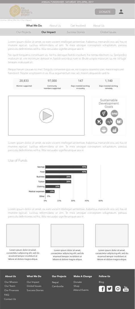
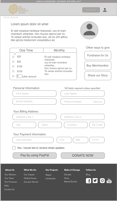
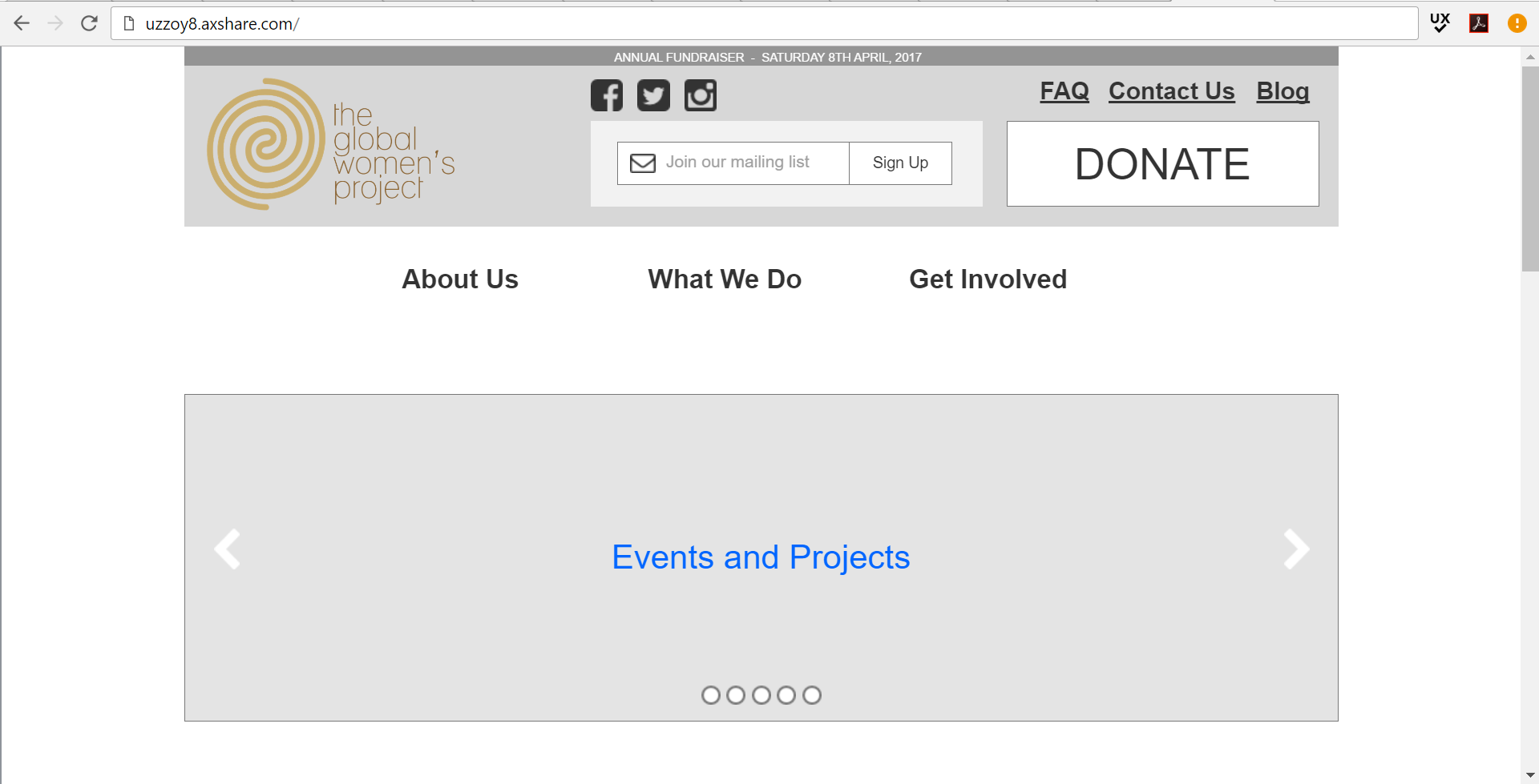
Clickable prototype

Recommendations
Key Recommendations
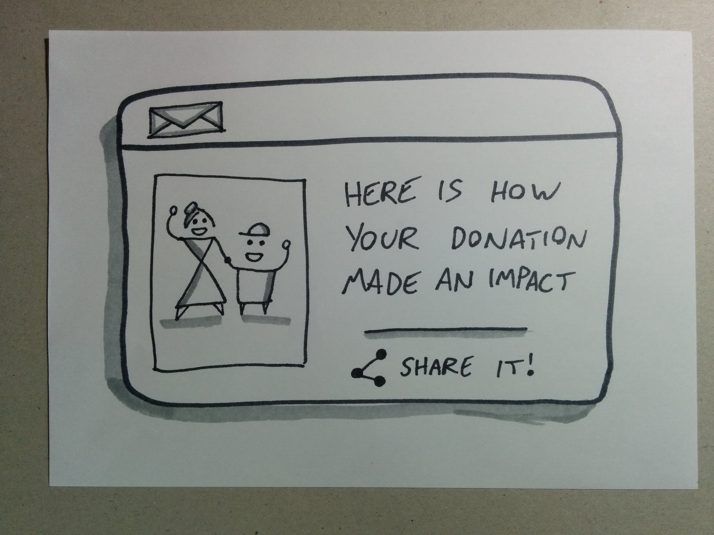
Show credibility and promote trust through showing timely content that reflects what GWP does and how it makes an impact
Encourage users to share content (particularly on social media)
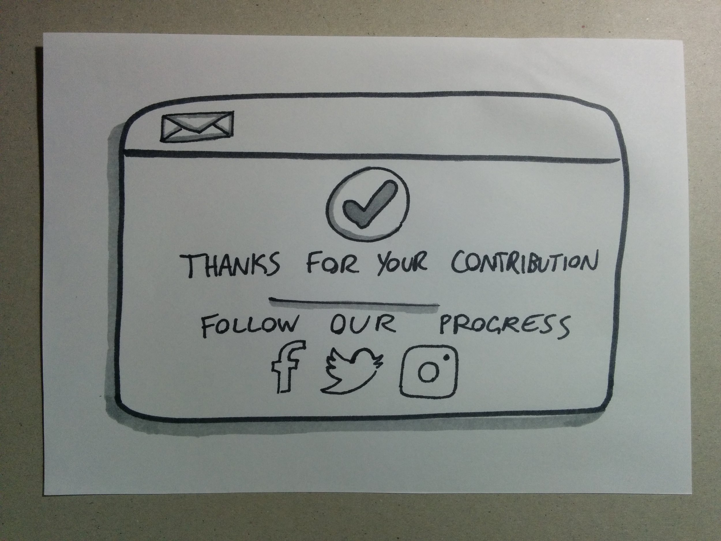
Reduce duplicate content and make it more concise under fewer pages
Provide a clear, simple and efficient way for users to make a donation
Long term strategy
- Individual project campaigns
- Progress goals to encourage accomplishment
- Promote sharing through social media
- User/Donor accounts + profiles
- Track donation history
- Provide an individual user “timeline” or story that users can return to and easily access updates on the projects they have supported
View more case studies
MELBOURNE METRO PROJECT
